Smartphone displaying website audit icons and checklists with U.S. skyline in the background, symbolizing mobile-first indexing.

Introduction: Are You Optimized or Outdated?

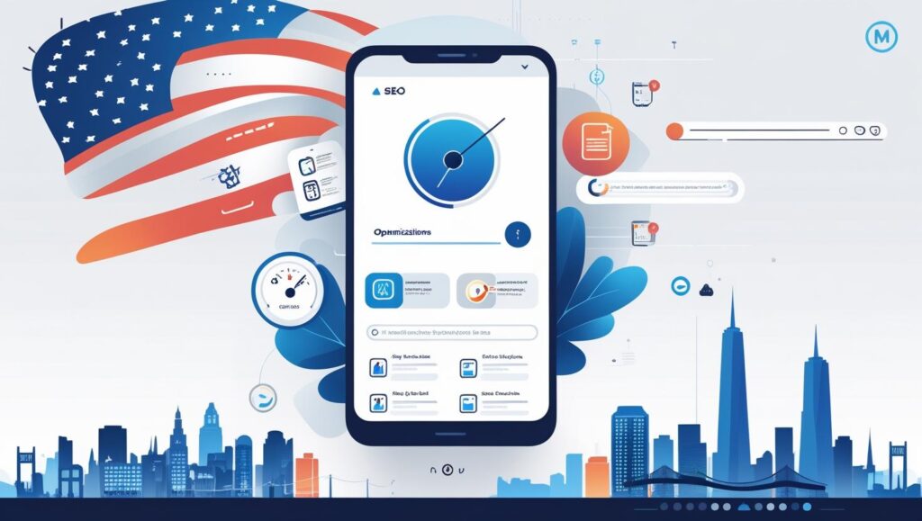
Imagine this: over 70% of your potential website visitors in the U.S., Canada, Norway, and beyond are browsing on mobile. But if your site isn’t optimized for smartphones, Google won’t take you seriously. In 2025, mobile-first indexing is no longer a prediction—it’s the rule.

Welcome to the future of SEO, where mobile comes first, and everything else follows. Whether you’re a new blogger, a small business owner, or a tech enthusiast, this guide will walk you through a mobile-first indexing checklist for 2025 to ensure your website is fully prepared.

In simple terms: Mobile-first indexing means Google prioritizes your mobile site version for crawling and ranking, not your desktop site.

Let’s break it down into actionable steps.


What Is Mobile-First Indexing? (Snippet-Friendly Definition)

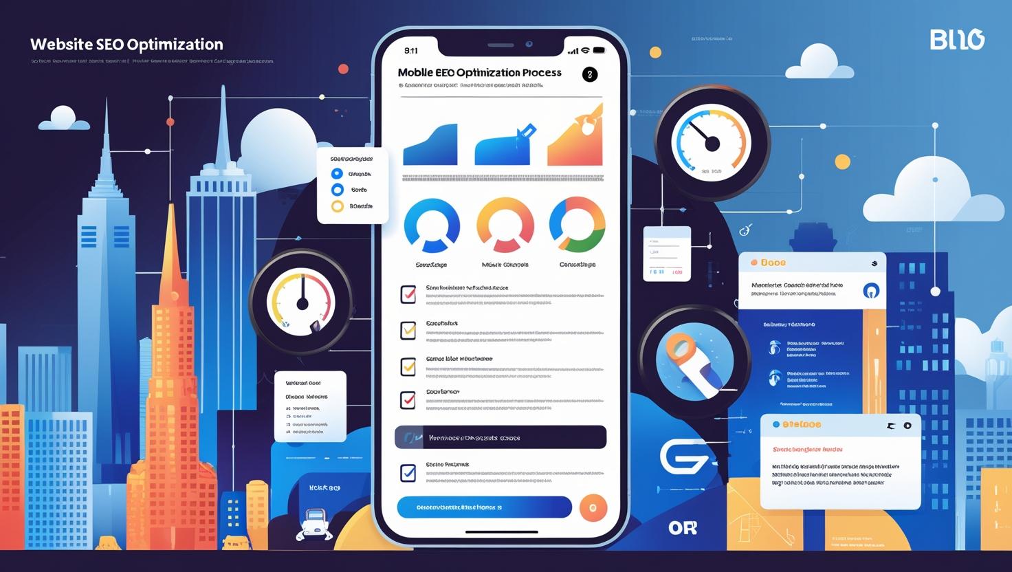
Mobile-first indexing is a Google algorithm approach where the mobile version of your website is used as the primary version for indexing and ranking in search results. If your site isn’t mobile-friendly, your rankings and visibility may suffer.


Why Mobile-First Indexing Matters in 2025 (Especially in the U.S.)

  • Most traffic is mobile: In the U.S. and other advanced economies, over 70% of search traffic comes from mobile devices.
  • Google’s crawling behavior has changed: As of 2025, all websites are now assessed primarily via their mobile versions.
  • User experience drives success: Mobile responsiveness, speed, and usability directly affect bounce rate, time on site, and conversion.

Web Write Tech recommends all websites (especially U.S.-targeted ones) go mobile-first not just for rankings but also to create a trustworthy user experience.


2025 Mobile-First Indexing Checklist

1. Use Responsive Web Design

  • Your site should adapt to all screen sizes (phones, tablets, desktops).
  • Avoid separate mobile URLs (like m.example.com)—they’re outdated.

2. Match Mobile & Desktop Content

  • Same content, metadata, headings, and structured data on both versions.
  • Don’t hide critical elements like menus or call-to-actions on mobile.

3. Boost Mobile Page Speed

  • Use tools like Google PageSpeed Insights
  • Optimize images, enable compression, and use caching.
  • Target <2.5s loading time on mobile.

4. Ensure Crawlability & Indexing

  • Don’t block mobile bots in robots.txt
  • Avoid lazy-loading critical content without fallbacks.

5. Optimize Mobile UX (User Experience)

  • Tap targets must be easily clickable.
  • Fonts should be readable without zooming.
  • Avoid intrusive popups or interstitials.

6. Validate Mobile-Friendly Design

7. Core Web Vitals for Mobile

  • Focus on LCP (Largest Contentful Paint), FID (First Input Delay), and CLS (Cumulative Layout Shift).
  • Use Google Search Console to monitor mobile performance.

8. Optimize for Mobile SEO in the United States

  • Include location-specific keywords.
  • Ensure schema markup works properly on mobile.

Common Mobile SEO Mistakes to Avoid in 2025

  1. Using separate mobile and desktop URLs
  2. Not testing on real devices (emulators are not enough)
  3. Hiding content or navigation elements on mobile
  4. Poor mobile site structure or confusing menus
  5. Not prioritizing Core Web Vitals (especially on mobile)
  6. Ignoring mobile loading speed
  7. Using outdated or Flash-based content

Best Tools for Mobile-First Optimization

Mobile optimization process illustrated with a phone, code snippets, search ranking icons, and responsive layout elements.
A tech-themed visual showing mobile site optimization tools and strategies. Designed to reflect SEO trends like Core Web Vitals, mobile responsiveness, and U.S. digital priorities.
Stay ahead of Google’s mobile-first indexing with a clear, mobile-friendly site strategy in 2025.
  1. Google Search Console – Tracks mobile usability issues & performance
  2. PageSpeed Insights – Measures speed & suggests improvements
  3. Mobile-Friendly Test – Confirms mobile compatibility
  4. GTmetrix – Page load testing for mobile devices
  5. Screaming Frog – SEO auditing (with mobile user agent settings)
  6. BrowserStack – Test how your site looks on real mobile devices

Mobile-First Indexing vs. Desktop Indexing (2025 View)

FeatureMobile-FirstDesktop-First
Google CrawlsMobile versionDesktop version
Ranking SourceMobile contentDesktop content
Speed ImpactVery HighModerate
UX FocusTouch & ReadabilityMouse & Precision

Google uses mobile-first indexing by default now. There’s no option to “opt out.” So, optimizing for mobile is not optional anymore—it’s essential.


Explorer Web Write Tech Services


❓ Frequently Asked Questions (FAQs)

1. What is mobile-first indexing in simple terms?

Mobile-first indexing means Google uses your mobile site as the main version for ranking and indexing.

2. How can I check if my site is mobile-friendly?

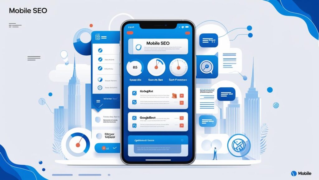
Use Google’s Mobile-Friendly Test to check compatibility.

3. Is mobile-first indexing a ranking factor?

Not directly, but mobile-friendliness, speed, and UX—which mobile-first indexing prioritizes—are major ranking factors.

4. What happens if my mobile site is incomplete?

Visual comparison of mobile and desktop SEO strategies for websites, with responsive UI elements and U.S. context.
A creative visual breakdown of mobile-first vs. desktop indexing concepts. Perfect for educating bloggers, beginners, and web owners about U.S.-specific SEO in 2025.
Is your website ready for mobile-first indexing in the U.S.? Compare mobile and desktop SEO visually.

You risk losing rankings. Google will ignore the desktop version and assess your limited mobile version.

5. Do I need a separate mobile website?

No. Google recommends responsive design over separate mobile URLs.

6. How do I improve Core Web Vitals for mobile?

Optimize LCP, FID, and CLS using tools like PageSpeed Insights and Search Console.


Final Thoughts: Is Your Website Truly Mobile-Ready?

By now, it’s clear that mobile-first indexing in the U.S. and globally is here to stay. If your site isn’t mobile-optimized, you’re not just risking poor rankings—you’re losing valuable traffic, trust, and revenue.

At Web Write Tech, we’ve helped countless businesses and bloggers redesign their sites with mobile-first principles. Whether you’re in the U.S., Norway, or Australia, the rules of SEO have changed.

Now’s the time to act. Use this checklist, run your tests, fix your mobile issues, and prepare your site for a mobile-first future.


CTA: Need Help with Mobile Optimization?

Contact Web Write Tech for a professional SEO audit or mobile-first redesign. Let us help you dominate the mobile search game in 2025 and beyond.


Pro Tip: Bookmark this checklist and revisit it every 3–6 months to stay current with algorithm updates and SEO trends.


Malik Haider

Post a comment

Your email address will not be published.